How can websites keep up with the millions of screens on the market? Responsive web design, or RWD design, is one way to accomplish this.
To put it another way, responsive web design means that your website (and its pages) can adjust to users’ needs and provide the best possible experience, whether they’re on a desktop, laptop, tablet, or smartphone. However, in order for this to happen, your website must be responsive.
What is the definition of a responsive website?
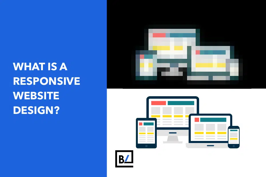
Responsive web design, often known as RWD design, is a current web design method that enables websites and pages to render (or display) across all devices and screen sizes by dynamically changing to the screen, whether it is a desktop, laptop, tablet, or smartphone.
How does responsive web design work?
Cascading Style Sheets (CSS) are used in responsive web design to offer varied style attributes based on the screen size, orientation, resolution, color capabilities, and other aspects of the user’s device.
Is my website responsive?
In your web browser, you can quickly determine whether a website is responsive or not.
- Open Google Chrome.
- Visit your website.
- Press Option + Command + I on Mac (Ctrl + Shift + I on Windows) to open Chrome DevTools.
- Press Command + Shift + M on Mac (Ctrl + Shift + M on Windows) to toggle the device toolbar.
- View your page from a mobile, tablet, or desktop perspective.
You can also use a free tool, such as Google’s Mobile-Friendly Test, to determine whether your website’s pages are mobile-friendly. While other design approaches, such as adaptive design, can achieve mobile-friendliness, responsive web design is the most popular due to its benefits.
Why should web designers and business owners care about responsive web design?
As a result of responsive web design, web designers, user interface designers, and web developers no longer have to spend their days and nights building websites for every single device that exists. It also simplifies the lives of business owners, marketers, and advertising.
Here are a few advantages:
- One website for every device: The website will be customized for the user’s optimal viewing enjoyment, whether seen on a 27-inch iMac or from the screen of your iPhone.
- Optimal design for any screen size: Responsive Web Design means that all HTML elements (such as photos, fonts, and other HTML elements) will be resized to fit the user’s screen.
- There is no need for redirects: Other approaches to designing for multiple devices necessitate the use of redirects to direct the user to the correct version of a web page. The user can access the content he wants to look at as quickly as possible without the need for redirects.
Responsive web design is also effective in terms of cost. It’s also easier to manage because there’s only one site instead of two. You don’t have to make the same changes twice. Instead, you can update and work from a single website.
Want to make your website responsive? The team at BaseLynk can help!